User Experience & User Interface
Intuitive digital experiences that make your brand easier to understand, easier to use and easier to trust - on any device.
Great UX and UI is invisible - it simply guides people to what they came for. We research how your audience thinks, map the journeys that matter, and design interfaces that are clear, accessible and built to convert.
The result: Interfaces people enjoy using - that quietly guide them to act.
How we
deliver it
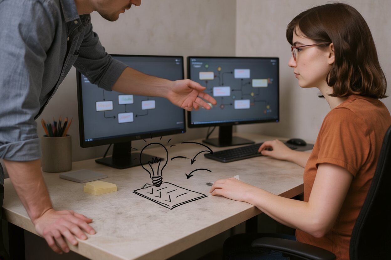
Research
We learn your users, their goals and where the current experience falls short.
Structure
We map journeys and wireframe the key flows before any visual design.
Design
We craft clean, accessible interfaces and interactive prototypes.
Validate
We test with real people and refine until it feels effortless.
Where it adds value, yes. Usability testing helps us catch problems before launch.
Yes - our design and development teams work together, so nothing gets lost in handover.
We design accessibility-first so your site works for everyone and meets modern standards.
Good design is the door you walk through without noticing it was a door
If your users have to think about the interface, they are not thinking about your product.
The best interfaces disappear. Nobody praises a door handle that just works - they only notice the one they pull when they should have pushed. UX is the discipline of never making people feel stupid.
Every confusing form, every mystery-meat button, every wait-where-do-I-click moment is a small tax on your customer's patience - and patience is the one currency you cannot refund. We design to remove those taxes. Not by adding more, but by taking away: fewer steps, clearer choices, one obvious next move at any given moment.
It starts with research, because you are not your user. What is obvious to the person who built the thing is often a maze to the person seeing it for the first time. We map the journeys that actually matter to your business, then wireframe them in plain grey boxes before anyone argues about colour - because if the flow is wrong, no amount of beautiful is going to save it.
Only then do we make it look good, and looking good is not vanity. Visual hierarchy tells the eye where to go. Motion reassures people that something happened. Whitespace gives a decision room to breathe. Done well, the interface guides someone toward action so gently they will swear it was their own idea all along.
And we design for everyone, on purpose. Accessibility is not a compliance checkbox we tick at the end; it is a better product for all of your customers - the ones on old phones, bright trains, slow connections and every kind of ability. An experience that works for the person having the hardest time usually works beautifully for everybody else too.
There is a business case hiding inside all this empathy, too. Every point of friction you remove is a customer who finishes rather than abandons, a support ticket that never gets raised, a refund that never gets requested. Good UX pays for itself in the boring, beautiful metrics - completion rates, repeat visits, fewer confused emails. You do not need users to consciously admire your interface. You need them to breeze through it, get what they came for, and come back without quite knowing why it felt so easy. That quiet ease is the whole product.